Tuesday, April 29, 2014

Roger Brown Iconic/Ironic

Roger Brown was one of the leading painters amongst a group of artists whom we have come to know as the ‘Chicago Imagists’. Art history likes –isms and –ists because its students are more comfortable with compartmentalising species rather than comparing the divergent characteristics of individuals. From many of the various readings, it seems the artists of this period in Chicago were uncomfortable with a strict collective definition but it has stuck and it does no harm; a little like ‘outsider art’; a concept which is globally fashionable but which also doesn’t need any more description than what it is: simply ‘art’. When artists are friends, exhibit together and make complementary works, it can oftentimes give the impression of a shared movement of artistic intent, rather than a common source to each individual’s imagery. Sometimes it is simply a very talented group of individuals who have been lumped together by chance, fashion or convention.
 
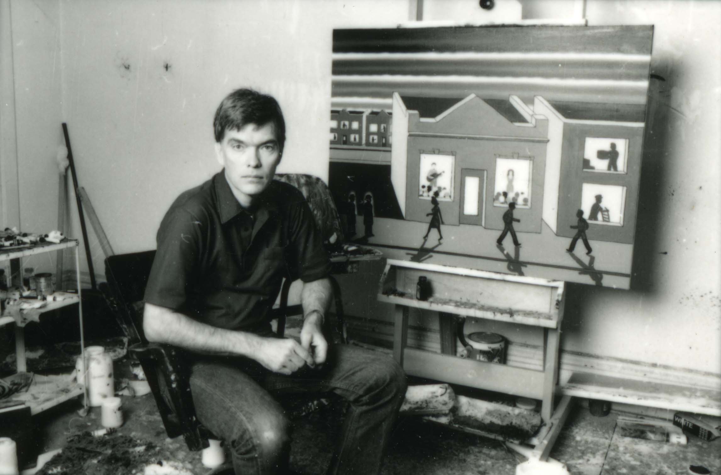
Roger Brown in his studio. Courtesy of the Roger Brown Study Collection. Visit the website here

Brown was a regular member of joint-exhibitions and surveys whose thrust and often even names perpetuated a group vibe. Whether Brown and his colleagues were part of a group or not is not of primary importance today; many of the artists are important in their own right and have recently been enjoying surveys and important solo shows. Ultimately, the artists of Chicago from 1966 to now were and are artists with highly individual energies. Their geographical proximity and shared rejection of the prevailing trends in American art at the time bound them more than anything else except perhaps a sense of fun and respect for the supremacy of surface and image over concept.

Nonetheless, Roger Brown was and remains one of the most individual voices in American painting. Despite this statement, he was an artist whose imagery benefited from many sources. Identifying these has become as much fun for art historians and students as quoting them clearly was for the artist in the studio. Whilst it is enjoyable (though exhausting) to pick where Brown’s individual works may have drawn from Georgia O’Keeffe, Arthur Dove, Sienese painting, the work of Joseph Yoakum, Giorgio De Chirico, primitive sculpture, southern folk art, etc. etc, it is his political and social commentary as much as his pictorial ingenuity that commands attention and which is the loose focus of the present exhibition.

Roger Brown died before his time in 1997, and whilst other artists from the period have enjoyed careers that have, along with their lives, endured, Brown’s politics within the work has at times existed in a conservative climate. Many paintings in the oeuvre of Roger Brown explore the politics of sexuality, homosexuality and the cultural stigma that was attached to the AIDS virus, which ultimately claimed his life, in America in the 1980s and 1990s.
To find a path towards the discussion of Brown’s sexual politics, it is important to traverse his visual landscape. Here, an assessment of the skyscraper works will serve as a backdrop for commentary on some of the contentious aspects of his practice.

To know what a Roger Brown painting looks like is to be expected of someone familiar with the work of the ‘Imagists’. Brown’s Land of Lincoln (1978) adorned the jacket cover of Who Chicago? the accompanying publication to the important exhibition of the same name that toured England in 1981. This is perhaps the most important contemporary book that banded and branded the ‘Imagists’. As for his imagery throughout a career, Brown is a good deal more than a painter of tall buildings, although these have been the works often chosen to illustrate him in surveys or articles, are the most sought after commercially and have become the regular mental images of what his work ‘is’ or ‘looks like’ over the years.

Brown possessed an accomplished and distinctive style. He enjoyed a command over composition that allowed for the successful execution of large canvasses with uncomplicated motifs, oftentimes repeating them with a rhythmic nature that was never monotonous. For instance, there is a musical quality to a work such as Buttermilk Sky (1974) with its repeating hills, shrubs and clouds that is kept lively by its various punctuations; a rearing horse, a campervan, a hitchhiker. A similar detail in Virtual Still Life # 22, the airplane is another of  these punctuations but this time an intended, subtle distraction. Within small offerings such as these, unfurl  narratives that are neither obvious nor meaningless. Thus, curiosity and voyeurism become central to Brown’s narrative. It is rare that the viewer is fully aware of the story behind a work’s image unless it is one attached to fact, as in one of his ‘history paintings’, for instance Assassination Crucifix (1975).

Roger Brown, Virtual Still Life # 22: Service with a Smile, 1996, Private Collection

Voyeurism is inherent in the architectural paintings. It is undeniable that Brown’s most famous works depict buildings. If these are his standout subjects, then their windows populated by stylized silhouettes are an important hallmark of his work. It was visiting the Roger Brown Study Collection in Chicago that I realized one aspect of why I had always taken to his work with joy. As a child, I had played with a vintage Dick Tracy tin squad car. The siren whirred as the wheels moved and on the side, front and rear windows, yellow squares framed the front, side and back depictions of the faces of Dick and the other officers in the car. Getting close up to some of the works in the 2012 exhibition, Roger Brown: This Boy’s Own Story  gave me the first opportunity to see the activities of the figures so often lost in images of the works from books.

The windows of the Hancock Building (1974) depict on one side of the sculpture such innocuous scenes as a group dancing, a man being admonished by a woman and a sole woman waving, whilst the  next side depicts several floors of raucous sexual activity playing out. Compare this to the sculpture in the McClain collection (now in the Madison Museum of Contemporary Art, Wisconsin), Skyscraper Pyramid (1974) and that seems an altogether better behaved address. Then again, in Me’s Building Highrise (1972) an entire lewd liason from anonymous meeting in the park to post-coital smoking seems to play out in a simultaneous depiction for one lucky couple on every floor of a strikingly similar building to the McClain pyramid.

Roger Brown, Hancock Building, 1974, Roger Brown Study Collection,
 the School of the Art Institute of Chicago. Visit the website here
 
Identifying Brown’s regularly appearing characters: the woman with her  hair elaborately coiffed, the young  man with his peaked at the front for example, is not of urgent necessity. If desperate to find identity, the publication Roger Brown: Southern Exposure bears two helpful images that the viewer may use to make up their mind: one is a self-portrait sketch c. 1960 whereby the hair on the youth mirrors that which recurs in the windows on the young figure. A second image depicts a photograph from the mid-1940s of his parents at the beach, where his mother wears her hair very similarly to the recurring woman (usually standing shocked). Neither hairstyle was remarkably rare for the era and reading too much into this, whilst tempting, serves no real purpose. Whilst art is arguably inherently autobiographical, Brown’s was about conveying the mood of the time. These paintings were as much about sexual liberation or repression in general, as about Brown’s own.

Identities and activities of the occupants aside, whether the architecture paintings became synonymous with the style of Brown because they were the strongest compositionally or that they assisted the placement of ‘Imagism’ in geographical terms is unclear. In an essay in the publication Art in Chicago: 1945-1995 prepared for an exhibition of the same name at the Museum of Contemporary Art, Chicago in 1996, Judith Russi Kirshner states “Brown positioned himself in his artwork as an anti-authoritarian outsider” and that he “anthropomorphized the city’s modern skyscrapers and paradoxically became the standard bearer for Chicago Imagism”.  Kirschner also weighs the suggestion put forward by Mary Gedo that the architectural works relate biographically to his “positive alliance” with architect George Veronda, (1940-1984) whom Brown began a relationship with in 1972.

Notwithstanding artistic motive, which likely varied from work to work, the city/building works are laced with wit, much like the modernist and post modernist architecture of the city. An industry flourishes along the river through Chicago with countless amusing but conflicting stories relating to the inspirations behind or architectural theories surrounding the buildings across the city, as told by  the guides on the river cruises that go up and down ad nauseum. Possibly none of the architectural works holds as much inherent humour as Post-Modern Res/Erection with Observation Deck (1984). Attached to this work is the most obvious notion of the attachment of ego to the size of one’s erection, architectural or otherwise. There is nothing subtle about the fact that even though Chicago’s John Hancock Centre is 25 meters taller than the Chrysler Building in New York, it is still 37 meters shorter than The Empire State Building. When ,in 1972, the first World Trade Centre soared at 417 meters it would take until the Sears Tower in Chicago was finally erected in 1974 at 442 meters before people could rest assured of their superiority in Chicago. Little articulation about the phallic connotations and the superiority/inferiority dilemma therein associated is really required. Remember, Hancock Centre was illustrated in Who Chicago as ‘Big John’.

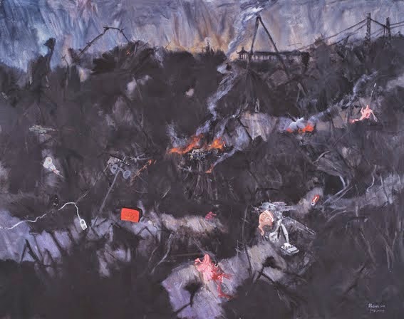
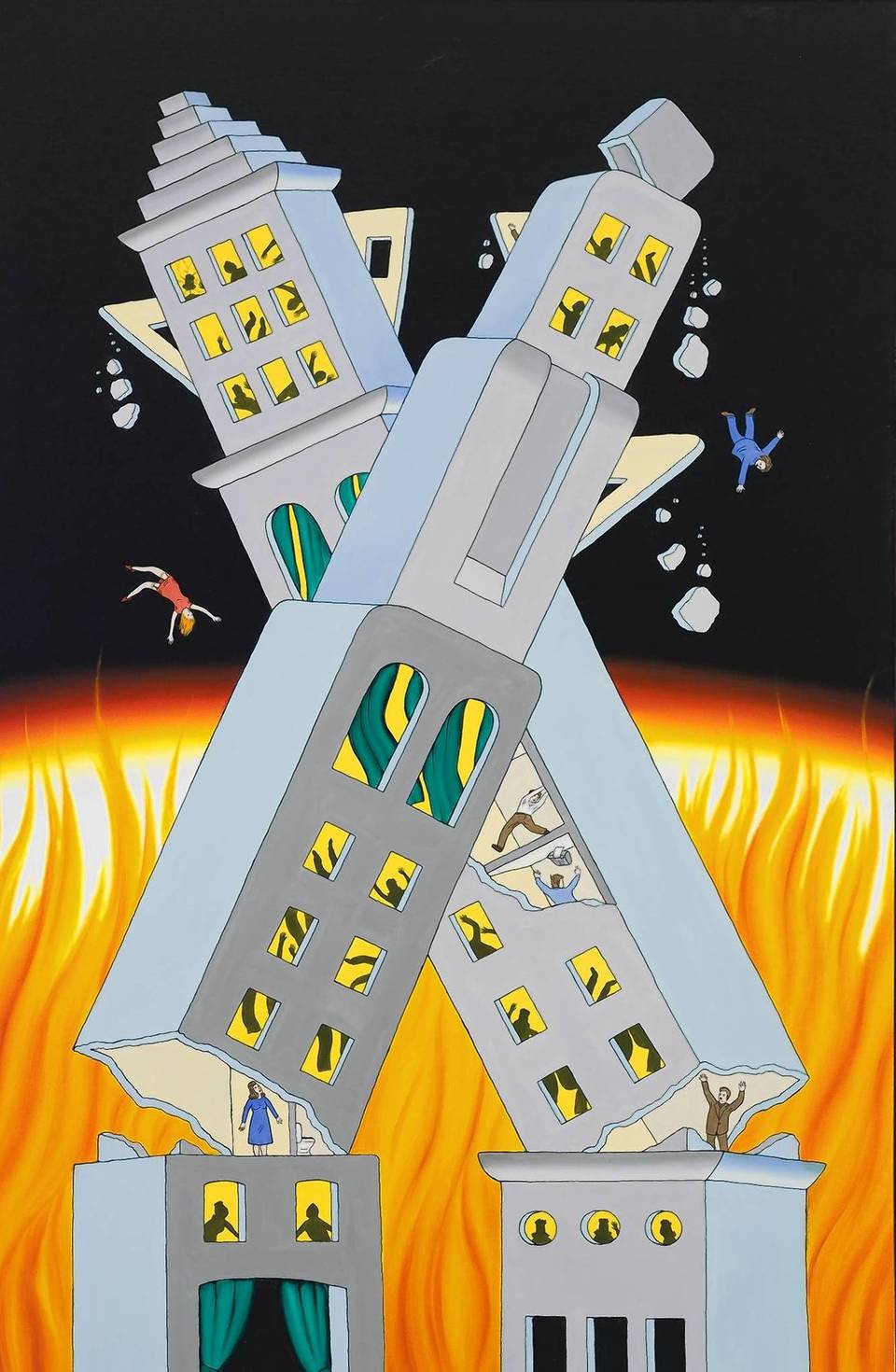
On a somber note, it is worth examining a number of works in a very different light, to put into the literature on his painting an interesting observation that followed his life. Brown, as will be discussed further below, was conscious of social and political events and often depicted them. Dying in 1997, Brown missed the earthmoving events of September 11, 2001, their aftermath and the visuals that the world was met with. One cannot help but consider Twin Towers (1977), the sculpture in the SAIC’s New Buffalo collection against the backdrop of preceding works such as Ablaze and Ajar (1972) in the Museum of Contemporary Art Collection, Tropical Storm (1972) and Midnight Tremor (1972). It is disturbing but difficult not to compare the grim imagery of the falling figures depicted in the canvases, tumbling, arms outstretched from the buildings whilst they crumble and breaks apart, to those photographs that few can forget of the victims falling to their deaths from great height before the twin towers came down. Brown, who never made an image flippantly seems, with a work such as Ablaze and Ajar to be portending something about the march of society, or the pace and peril of modern life. Within this frame, these works lose all their humour and adopt enormous power. Such is the strength of the period’s motif.

Roger Brown, Ablaze and Ajar, 1972, collection of the Museum of Contemporary Art,
Chicago. Visit the website here
 
There is probably little doubt as to the side of politics Brown might have fallen on as dictated by his art alone. The imagery of his political discourse is fairly liberal and the wit with which it is portrayed has the hallmarks of that thoughtful, amusing style of political commentary Australian audiences might associate with the pages of the New Yorker. This is not a strictly speaking ‘Democratic’ viewpoint, but at least a thoughtful one. His outlook might at once loathe most of the politics of Reaganism but adore the charm, bravado and at times self-parodying nature of the Reagans themselves. The present exhibition, His American Icons draws specifically on Presidential Portrait (1986). This work, now in a private collection in Sydney, is a classic piece. It puzzles me that it has hitherto remained unsold in the estate. Included in the 1987 retrospective of Brown’s work at the Hirshhorn Museum and Sculpture Garden, and illustrated on p. 80 of the catalogue, it is one of the great directly political works in his output. It could be advanced that the subject had posed a problem with his otherwise Democratic audiences in liberal Chicago and New York.
The irony so successfully portrayed by an artist who owned a novelty pair of Reagan slippers is the crucial aspect to the work. Irony is a central theme in the political works: Brown was not in the business of jamming tough medicine down the throat of his audience; his was a point that was best delivered with cutting but amusing elegance. Much like a joke at someone’s expense, his political works are laced with enough humour to provoke either hearty amusement or at least nervous laughter, often both when successful. Presidential Portrait does speak about American icons. Politics is polarizing. The simple image of Obama’s Hope campaign from the 2008 election raises both pride and ire depending on the audience. How dearly we might long to see how Brown, the most visually communicative and specific artists of his day might have commented on the characterization of America now: how would Brown record the election of Obama or document the Gifford Assasination attempt or the tragedy of the Sandy Hook Elementary School shooting? One particular event in the United States that Brown should have been able to depict upon his canvas was that important court ruling in 2013 when the US Supreme Court struck down as unconstitutional, the key section of the Defence of Marriage Act (DOMA), passed by the Clinton administration (who would later advocate its repeal) a year before Brown’s death . The most enduring image from this episode was Jack Hunter’s cover of The New Yorker depicting the Sesame Street ‘friends’ Bert and Ernie watching the ruling on their television.

Roger Brown, Presidential Portrait, 1986, Private Collection
 
Writers are careful with the sensitive nature of Brown’s ultimate demise. However, one should be disinclined to remain too politely silent about what invariably, the man who painted Aha! Heterosexuals Fuck Too (1991) clearly wanted debated. Attitudes towards both heterosexual and homosexual victims of HIV and AIDS remain varied. Aha! is a powerful work dealing with how ‘civilized’ America was supposed to deal with the iconic Magic Johnson suffering from the ‘gay’ disease. Stigma has haunted this virus and it continues to do so. More and more education, prevention and better treatment is changing this perception, however it has some way to go. That said, as with the newly unconstitutional nature of DOMA, and more nations legalizing same sex marriages, attitudes are changing; something that Brown had begun discussing many years ago. His works today are important pioneering images at the beginning of that arduous path.

Roger Brown, Aha! Heterosexuals Fuck Too, 1991, Roger Brown Estate
Painting  Collection, the School of the Art Institute of Chicago. Visit the website here
 
Roger Brown painted sharp, idiosyncratic paintings and made sculptures that challenged and played with the conventions of the boundary between fine sculpture, low object and also painting itself. From the earliest canvases in the current show, the theatre images, to the California Gawkers painted in the final year of his life, he advanced his argument about how form could be non-naturalistically but elegantly conveyed on a canvas. There is much to be said about the importance of Roger Brown’s subject matter, and throughout the oeuvre it calls for fun as well as serious considerations. The most powerful of Brown’s works interlace irony with his desired message; they use a playful gesture or narrative to convey his statements.

Roger Brown, California Gawkers, 1997, Roger Brown Study Collection,

he School of the Art Institute of Chicago. Visit the website here


EH

Copyright © Evan E Hughes


Tuesday, April 22, 2014

Joe Furlonger The Balonne Breaks Out Crossing the Divide

The road from Brisbane to Warwick is a scenic route passing through the Fassifern Valley towards the Darling Downs and Cunningham’s Gap. We’re headed towards Warwick so Queensland landscape painter, Joe Furlonger can work on a series of ink drawings using Chinese ricepaper. The day before, we were in Furlonger’s Samford Valley studio (half an hour north-west of the Brisbane CBD) discussing framing, farming and other aspects of the upcoming exhibition of new South-East Queensland landscapes. They will be shown in Brisbane and Sydney. After a lengthy session addressing the paintings, we turn towards the end of the studio in which Furlonger works on his drawings. The traditional Ming dynasty style table, as ever is piled high with paper and crusted with ink and paint. Gouaches of all sizes, watercolours with feint but astute pencil markings and the obligatory pile of ricepaper sheets are in a frenzied state of Furlonger’s own organized chaos. The gouaches, we decide can be sent down in a box overnight for Ray, my father and Joe’s primary dealer since 1984 to cast his eye over. The last publication that I produced for Furlonger (Glasshouse Mountains, 2010) was in the process of being sent to our printer when my father walked in from the airport with a series of watercolours in his overnight bag that he claims I had missed during my visit (but which I contend the artist must have produced subsequently). These quite literally stopped the presses so that they could be included. As a postscript, some weeks later one of Furlonger’s key supporters scrawled his initials on those pages whilst I sat with him in his Melbourne office, indeed one of them found its way to my own wall at home. So, the Senior Hughes, we decide will lead the selection of works on paper. However, Joe is unhappy with the ricepaper works so far. Some of them have ‘been overworked, they’re a bit lost’. It is apparent that Furlonger has used some of these works, as a means to make decisions on how to describe the landscape in his new canvases. I am looking at four or five of the 43 cm square works that are layered with varying marks. He has drawn the ridgelines of Cunningham’s Gap using a mark that is about 2 cm thick in dark black ink. Along these are a series of smaller, more staccato marks, which populate the horizon with trees. Across this is a thin wash of ink, a shadow cast by Mount Mitchell perhaps, the craggy rise that looms along the Cunningham highway ten miles west of Aratula. Then with the same thicker line, an opposing range has formed, almost on top of the first. The trip we are to undertake is to get ‘another shot at these hill drawings’. 

Joe Furlonger, Ink XII, 2012

The next morning, about an hour or so out of Brisbane and we are winding up the steep incline of the Cunningham Highway, crossing the Great Dividing Range. Suddenly, from the passenger seat, Furlonger has spotted a gap in the treeline flanking the two-lane road and we stop where it is relatively safe to do so. Having gotten out of the car Furlonger has the top off the thermos for a coffee. This, I soon realise is only an excuse. ‘I guess this will make a good medium for the ink’. Without much fuss, he has his felt and ricepaper laid out and has mixed some of the black coffee with his Chinese ink. As a steady flow of lorries cross the Divide on their way to collect produce in the fertile Darling Downs, the artist works on about 12-14 views of a quite dramatic section of rocky outcrop bathed in early morning sunlight. There are patches of very pale light accentuating the shadows and shape of the trees on the side of this hill. After only about twenty minutes, Furlonger has worked hurriedly, we move on, not relishing the prospect of explaining the necessity of capturing that particular moment in that necessary spot to the Queensland Highway patrol. Back in the Studio, stapled to the wall is the last painting which has been finished by Furlonger and which has not yet found its way onto a stretcher. It is the final work in a series of four paintings depicting Cunningham’s Gap. The painting is composed of a series of green hills, balanced by a cream or greyish yellow expanse on the right side of the canvas that runs towards the horizon. This work and its three cousins are all punctuated by buildings, roads and features, which seemingly rise from the surface. This motif, which recurs in Furlonger’s paintings, is achieved through layering the acrylic-bound pigment in a series of wet on dry visits. Sometimes there will be more than one canvas receiving his attention, depicting similar views or scenes. He visits them simultaneously, working one, then the other. He will continue to work a number of canvases, returning to the first when it has sufficiently dried, and so on. I have watched him work in this method on paintings of Moreton Bay, effortlessly achieving the colours of those mudflats that transform the bay from a bright blue, to a military green depending on the angle of the sun.

Joe Furlonger, Crossing the Great Divide, 2012 
Joe Furlonger, View from Cunningham's Gap, 2012
 
This method works less successfully when Furlonger employs it without a clear idea of drawing in his mind to begin with. Having witnessed the pace and excitement with which Furlonger has been applying lines in his drawing for this exhibition, I recognize that these paintings are enjoying a renewed sense of profound confidence that was certainly evident in the series of landscapes that were produced depicting the hills around Guangzhou in the China series in 2008. One particular work from that series, Traveling amid Mountains and Streams is an interesting point of contrast. The works, whilst exploring the same perspective favoured by Furlonger, of a steep downward angle, also share a dedication to the line. Furlonger produced a great number of the aforementioned format ricepaper works whilst on the ground in China. Then returning to the studio to work many of the paintings. The fascinating point of departure here is the light. At the time, my catalogue entry for the China show described in somewhat forrid terms, a ‘confounding but beautiful’ layer in the sky.  
 
Joe Furlonger, Travelling Amid Mountains and Streams, 2008 
 
John McDonald helpfully paraphrased in his Spectrum column at the time by way of noting that there is smog in China. A comparison of these two works, perhaps depicting different actual physical locations but certainly two that share a sense of perspective and place, reveals Furlonger’s dedication to light. It is a dedication which is often overlooked, but which is perhaps the most important aspect of his colour choices when mixing his pigments. The Chinese work is devoid of those sharp reflections that a piercing sun brings up, these new Australian landscapes are truthful to the point of fixation with regards light and colour. It is quite extraordinary that a demonstration of black and sepia drawing brought this to my attention, and of course they must be read in connection with the hundreds of gouaches and pastels that Furlonger makes in the lead up to any show. In regarding the dedication he has to drawing, it is his truthfulness that is most striking. He can capture the features of an entire valley, of several hundred acres of land, in a handful of lines. When Furlonger’s landscape is considered it can be the colours that are the most memorable moments. It is difficult to forget the generous words of John Olsen, who in 2003, when interviewed for a documentary on Furlonger broadcast on Channel 9’s Sunday Program, offered “you transport Joe Furlonger to a place and the place says colour me in, and that’s what he does”.
Indeed, it is difficult to overstate the importance of colour in Furlonger’s landscapes, however there is a strength to this suite of paintings which brings them above the landscapes of the last decade, beyond even the elemental success of China. This body of works boasts the strongest power of descriptive drawing, perhaps in his entire oeuvre to date. It is the accurate sense of location, the sense of directions and of landmarks that sets them apart. Furlonger is standing in a field with a brush, is looking out across at his subject and with a sharp eye is capturing it faithfully.
The entire suite was executed in a period of only about six months. Much of Queensland’s South and most famously the capital city of Brisbane were devastated by flooding in 2011 and then again in 2012. The La Nina weather pattern has transformed a region once affected by drought (and witnessed in the dry Furlonger paintings which climaxed in 2006) into one which has, in a short period of time, been literally drowned. The images of Brisbane’s CBD under water made their way around the world and for the 2011 Wynne prize exhibition, Furlonger executed a particularly strong image of the day the Brisbane River peaked.
 
 Joe Furlonger, Brisbane River in flood, 2011

The central subject in this exhibition is his series of canvases depicting the Balonne and Moonie rivers. These works ought be considered in the context of his Brisbane River in Flood painting. The serpentine river-lines produced by Furlonger are in some ways uncharacteristically disciplined. There are some unmistakable poetic flourishes, such as one river work (not depicted in a plate, but viewed in one of the supplementary images of the artist unrolling a work at the rear of this publication).
 
Joe Furlonger, The Moonie in Flood, 2012
Joe Furlonger, Channel Country, the Balonne, 2012
Joe Furlonger, View from the Campsite on the Moonie, 2012
Joe Furlonger, The Balonne Breaks Out, 2012
Joe Furlonger, Moonie River with Wheat Storages, 2012
 

This work is closer to zen calligraphy than the muddy unfolding Balonne in the cover work of the show. The most interesting point of comparison in these two works is their respective energy levels. The Brisbane painting is made up almost as a pastiche. It depicts a city scape at the bottom of the canvas, the water is a frantically flowing river that is laid in strips of paint of varying hues of yellowy brown. The three bridges are drawn from the work he had been doing between 2010 and 2011 of the bridge from Bribie Island to the mainland and in the distance is a series of hills, which are more recognizable from the 2010 Glasshouse Mountains series. The great benefit for me as a writer on Furlonger is that I am also his dealer, and I am made acutely aware of the audience’s reactions. I recall one viewer passing judgment that they couldn’t recognise what point of the river it was. They knew Brisbane and couldn’t recognize the bridges, where the high perspective point was and why there was a view of the mountains. For that paiting, the sense of place was less important than the sense of panic and urgency; the feeling of sheer chaos which the painting invokes and which the whole state of Queensland felt at the time.

The Brisbane flood painting is only a starting point for the St. George paintings. The series of canvases are defined by their bold, muddy snakes of riverbend. The river runs through an active landscape in nearly all of the works. The light distinctly changes from canvas to canvas. The beautiful purple horizon in The Balonne Breaks Out is so clearly the product of preparatory work with gouaches. Furlonger explains that the time spent camping by the Moonie was a productive period for his works on paper. The trip took him to that river west of St. George where he camped (see Plate 26) and also to the Balonne river. It was the first extended period of travel to a ‘landscape location’ for Furlonger since at least China or the time he spent in the Arcadia Valley in 2002/3. That process of being outdoors for the various phases of the day is important for Furlonger who famously starts such days with ‘coffee and watercolours’. Not only did the period of travel to more remote landscapes benefit his attention to the activities of the light, it allowed for reflection on the unusual. When he painted the subject of his immediat environs, such as around the Samford Valley, or previously, when he lived in Palm Beach on the Gold Coast, there was a tendancy towards a comfortable approach to the physicalities of the place, conscentrating on more esoteric aspects of shape and rhythm in the works. This produced some quite beautiful work, such as the harmonious colorist Samford Valley series of 2009 or his rhythmically inclined musings on the Glasshouse Mountains of a year later. However Furlonger’s recent travels through not particularly lyrical landscape, through weatherbeaten ‘working Australia’ is a return towards of the paintings of 1995 - 2005. The notion of ‘working Australia’ as a subject is not new to Furlonger, past works have featured the geometric assignations given by irrigation and property divisions. One classic piece is a rich ochre base where a bright blue tractor is the immediate focus. Similar inclinations occur in some of these works, most memorably in Moonie River with Wheat Storages, where the river bend is flanked by what first appear to be pools or dams of water. The artist explains these are in fact the representations of a novel way of storing the excess what produced by the recent bumper crops underneath blue tarpaulins. They keep them there ‘waiting for the dollar to go down’ and the International market to return. It is here that one recalls that the landscapes that have been produced are not the attractive renderings of idyllic spots, but a documentation of the Land as a concept. Of the Cunningham Gap group, I enquired whether the grey underpainting on the face of the Mountain represented rocky ground. No, I was informed, ‘it’s roundup’. Roundup-ready Field is another of these brutally honest paintings of the herbacide being applied to commercial farming land. Yet, like the beauty that was evident in the smog-blanketed valleys of China, there is a similar attraction to these fields, whether because of their aesthetic finish in Furlonger’s fine powdery surfaces or an air of pride in the land. Furlonger has more knowledge of the workings of agriculture than any landscape artist I have worked with. I was too young to have spent much time with William Robinson when he exhibited with my father, but his own cultivation of animals certainly made more sense of the Farmyard paintings than many others who have attempted such things. Lucy Culliton is the other artist who has an immediate attachment to her land through her animals and daily work. Furlonger has been involved in rural labour, applied herbacide, worked slashers and has a fascinating knowledge of the history of farm machinery. It is quite difficult to imagine John Constable tilling the Fens atop a Chamberlain Champion, but that is an Australian-made tractor after all, Furlonger informs me.

Joe Furlonger, Round-up Ready Field near Dalby, 2012

The final important group of works from this series are the figurative ones. Furlonger has put figures in the landscape before, notably in Broome and Moree. The livestock paintings here are sometimes drawn from times where he is doing ink paintings on the side of a road beside a cattle farm (as was the case about 10 kms outside Warwick). Others might be aided by photographs of (Queensland Senator) Barnaby Joyce behatted and striding bowlegged through Roma. Furlonger can not escape the figure in this series. So integral to his subject is the people who impact upon it. So much of the landscape tradition is the depiction of what nature has given us.
 
So much of Furlonger’s painting is the deciphering of what man makes of it.
 
Joe Furlonger, Applying Herbicide, 2012


EH


Copyright © Evan Hughes, 2014

Tuesday, April 15, 2014

Jinsong A Painter of Chinese Modern Life

Beauty is a conundrum. There are beautiful things and there are images of beautiful things. There are visual idealisations of imperfect things and imperfect renderings of otherwise splendid things. What is it that makes a rotting piece of fruit less beautiful than a fresh and ripe one? Is it anything at all when the likes of a seventeenth century Dutchman can render the former in such a compelling manner so as to restore its beauty immediately?

There are numerous treaties on beauty, and yet perhaps the difficulty in finding its definition is down to the fact that the term itself: ‘beautiful’, is used to describe the indescribable. Because one man’s Madonna is another’s Medusa, and vice versa, the definition of beautiful will differ infinitely, from each beholder to the next. Therefore it is not overly precarious to define beauty along the terms of the compelling. You find yourself drawn into someone, or something, you cannot describe it, you are compelled. You find that person or object, beautiful. In many ways if one follows this line, the concept of what it is to be ‘beautiful’ is interchangeable with that of ‘shocking’.

Consider the rotting fruit again; when depicted in layered oil glazes by for instance a de Heem or a Breughel, the lustre of the fruit, slick with its sheen of emanating juice, draws the eye immediately. And yet, is this because the subject itself is beautiful, or rather because there is an element in human nature that is particularly drawn to, if not the evidence, at least the notion of death and decay?

Jan Davidsz de Heem, Still-life with Fruit and Butterflies, National Gallery of Canada

Explore the collection here

I think of the Cubists when I think of Yang Jinsong’s paintings, as do I think of the Dutch still-life painters I mentioned earlier, An artist such a Pieter Claesz had only but to depict a rich open pie, golden crusted, filled with fruits, meat and nuts perched next to a beautifully curved knife at its opening to speak volumes about the comfortable wealth of the Netherlands in his era. In doing so he could also speak of an opulence, which was at once unbecoming for a nation whose supposed puritan values would have had them be more modest. He was not moralising but rather merely remarking, he most probably enjoyed consuming the beautiful objects he depicted as much as he did creating the images of them. Another great source of wealth, though also a vice, which was included by Claesz and others was the depiction of tobacco and the paraphernalia of smoking. Often there would be a conical wrap of printed paper, out of which spilled the evidence of tobacco. A pipe might be in the background and the thinnest wisp of smoke lingering above the composition. The inclusion of the vice certainly hints briefly towards sin, but also speaks in terms of the impermanence of life. The fleeting nature of smoke that is here one minute, lingers and then is gone. Jinsong’s paintings also include these symbols of sin. Jinsong’s fish are at times scattered with syringes or pills. Now, if one things of the Tobacco which was famously traded out of the Dutch East Indies, and then considers the volumes of opiates, mainly heroin produced in the border regions of China, indeed a narcotic itself which was for many years through the 1970’s and 1980s called ‘China White’, one observes a very tidy link.
Pieter Claesz, Still-Life, 1636, Museo Thyssen-Bornemisza, Madrid, Explore the collection here
 
Now Picasso and co. they liked Absinthe. They liked young, beautiful, loud prostitutes and they loved to consume fabulous bottles of wine. The cafĂ© collages and cubists musings of the 1910-1920 years tell us as much. So much preoccupation can peak only of the voluminous understanding of how much fun they could have. That is not to say they didn’t know these excesses were bad for them. Then again, Picasso did not moralise, in the entire canon of literature on him, no one would level that accusation at a man, one of whose earliest famed works is a self-portrait as a late teen being administered fallatio by a Spanish prostitute. I cannot accuse Jinsong of moralising, his paintings don’t they comment without prejudice, though they staunchly fail to deny the ugliness around us.

Picasso, Pipe, Glass, Bottle of Vieux Marc, 1914, The Solomon R. Guggenheim Foundation,
Peggy Guggenheim Collection, Venice. Explore the collection here


Yang Jinsong’s paintings over the last five years have been a discourse on human behaviour, and of beauty. Yang Jinsong’s fish paintings are unquestionably beautiful. Some are grotesque in their violence, some are so sensual in their colour and expressively laid brushstrokes that the viewer is almost repulsed to the pint where they can smell the rotten flesh of the fish and the gag reflex is very nearly tempted. Either way, one does not eerily turn away from these paintings. There is something about fish itself that is extremely provocative. The protein has the tendency to completely polarise people, one is either a fish eater, or staunchly not, some will only eat fish and many others just can’t stand the smell. In Australia, where over the last two decades at least, the procurement of fresh seafood has been a relatively gentle challenge, we tend to be more pictorially tolerant if not inclined than elsewhere in the world. Indeed, it is no great surprise so many of our finest national chefs have all but made their name on the back of the freshness of the industry here. In China, fish holds the tendency to serve as a great delicacy, and equally become the picture of nightmares. 

 Yang Jinsong, private collection, Sydney
 
The concept of hospitality in China is a little different to that which westerners are used to. A western businessman might ask a client to dine and think himself generous if he picks up most of the tab for a modest lunch at the local brassiere. In China, Corporate hospitality seemingly knows no bounds. Banquets that last hours into night are commonplace, and usually end with the most torturous karaoke known to man in grim smoke filled rooms reeking of white spirit. At some point along the way, at any business-oriented banquet worth its salt in China, one or more fish will be presented. It will be proudly thrust beneath the eyes of the guest of honour who will look down at the glassy black eye of some recently steamed bass or two. Maybe it’s the English, with their pedantic attention to neatness and order that the Dover Sole is perhaps the only truly tidily deconstructed fish I can think of. As I have known it, there is no neat way to eat or portion these live fish presentation platters at a Chinese banquet. The fish comes to the table, everyone duly appreciates it, and more often than not a comically intoxicated host proceeds to portion the fish to their guests. By this usually late stage in the meal, bones, guts and whole chilli garnishes are quite an afterthought. What is thought to be the finest delicacy to bestow upon a guest is more often than not tiresomely difficult to consume. The most beautiful intended part of the meal is also the most challenging.

                                                                 Yang Jinsong, private collection, Sydney
 Yang Jinsong, private collection, Sydney
 
At the end of any of these Banquets, if one has survived the rice wine, comes the fruit. The like of which I mentioned earlier, it must be said, I have rarely experienced the limp flavourless watermelon which one can easily find in a country where supermarkets import fruit year round from wherever is convenient. In China, usually at rural restaurants, the melon is amongst the sweetest and juiciest you might imagine. And yet with this sweetness, comes the undercurrents. I have been fascinated to witness the appearance of the coupling figures in Jinsong’s recent paintings. These pink-fleshed girls clad in their black fishnets are up to all sorts of mischief in and about these enormous melons (whose obvious connotations are perhaps a little misplaced with regards to my observations of the Chinese bust). The seedy undertones of sex are never far away from the Chinese Banquet. After the meal, businessmen will be carted to the nearest teahouse to be entertained by their hosts. If the host is looking to score big points he will simply have a series of girls paraded in the restaurant (when the mood is convivial enough). This is when the Karaoke starts. On each trip I have taken to China there has always been at least one or two stories in the South China Morning Post or the China Daily English newspapers about a loyal official getting himself into trouble around about this time in the evening and a short, sharp moralizing column ensues. Jinsong’s luscious offerings of his bursting melons, littered with microphones and naughty nymphs, do just enough to set the scene without being erotic, moralising or boringly pornographic.
 
 Yang Jinsong, private collection, Sydney
 
Alongside the still life painting of Yang Jinsong sit his landscapes, He is perhaps not same painter of landscapes as he is of the stunning food compositions, however in an exhibition such as this they play a very important role in the literalising the themes on which eh touches in the former paintings. An Olympic games is for its host nation very much the proud presentation dish. They are the richest offerings of the splendour of a culture and its progress in the world. For the most part. Or at least what was broadcast around the world, the Beijing games were a glittering success performed underneath miraculously clear skies (for China). The games showcased the most architecturally remarkable arena and were a technological marvel, envy you couldn’t access the BBC website. Perhaps these games are all too often offered as an example of veneer over truly wonderful inner workings, at least of the country as a whole. Jinsong’s Black Lotus’ purposely includes the Olympic flag and the viewer starts to get the sense of what it is the darker elements in the brighter paintings all refer to. These landscapes are bleak, they are uninspiring and they are most certainly not beautiful. And they remind me too clearly for the drive, which I have taken a number of times between the cities of Beijing and Tianjin. These dark paintings are stark reminders of a darkness, which lurks in modern China, but of course not just China, but anywhere. I spoke earlier of glorious colourful de Heem paintings or of the boisterous vices of the cubists. The drive between Beijing and Tianjin is quite beautiful compared to those grim railway stations in the industrial ghettos around Rotterdam or the grey concrete outskirts of Paris. There is light, and there is darkness. It is not a Chinese thing, but very much a modern thing.
 
Yang Jinsong, private collection, Sydney


EH

Copyright © Evan E. Hughes, 2014